Portfolio / Tableau Pulse & Project Nexio
AI/ML NLG Agentic AI Data Storytelling Tableau · Salesforce

Designing trust into
AI-generated insights

After our startup was acquired by Tableau, I led design for Project Nexio — the 0→1 initiative that became Tableau Pulse, Salesforce's AI-powered business monitoring platform. Showcased live at Dreamforce 2022 with branded demos from L'Oréal, Ford, and Truist Bank.

100M+ Insights generated in Q1
35k+ Metrics created in Q1
2022 Dreamforce launch
Design Lead My role on the project
Tableau Pulse homepage — Today's Pulse metrics grid showing Ad Reach and Sales metric cards with sparklines, AI summary, and follower counts

60 people. One acquisition. Overnight complexity.

In 2021, Narrative Science — the startup where I was a product designer — was acquired by Tableau, which had itself been acquired by Salesforce. Overnight, our ~60-person team became part of one of the largest enterprise software ecosystems in the world.

We had a tiny, scrappy core product group: 3 designers, 3 PMs, ~45 engineers. The environment was intense — high expectations, unfamiliar systems, unclear leadership structures, and a significant amount of organizational ambiguity to navigate.

"Tableau was powerful, but still too complex for everyday business users. Adoption from non-analyst personas was dropping. The business needed a new, modern way to surface insights — without requiring anyone to build a dashboard."

That gap was the opportunity. And Project Nexio was how we went after it.

AI-generated insights have a trust problem.

The core UX challenge wasn't just "make data readable." It was: how do you design for confidence in AI output when users don't know why the AI surfaced something, whether to act on it, or whether to trust it at all?

We were designing for business users — not analysts. People who make fast decisions and have no patience for dashboards, but who also can't afford to act on a wrong signal. The AI needed to feel authoritative without being opaque. Helpful without being condescending. Urgent without being noisy.

That tension — between surfacing AI confidence and maintaining user trust — shaped every major design decision on this project.

Design lead, loaned across organizations.

I was loaned from the Narrative Science design team to the Tableau Pulse team — which meant I had to build credibility fast in a new organizational context, with a new PM, new engineering team, and new design manager, while still staying connected to my original team's direction.

Design Leadership Translated early Nexio concepts into a scalable, shippable AI insights product
Stakeholder Alignment Drove clarity post-acquisition across conflicting executive visions
Research & Facilitation Led workshops, journey mapping, and prototype reviews across orgs
End-to-End Delivery Owned Homepage, Email Digest, Search, and Follow/Unfollow workflows

The team

Aditya Yellamraju Design Lead — Pulse core experience
Director of Design Narrative Science — Manager & strategic partner
Design Manager Tableau — Acting manager for Pulse
2 Tableau Designers Metrics detail page + Metrics setup experience
Content Writer · Visual Designer · Researcher Cross-functional collaborators
1 PM · ~45 Engineers Tight partnership throughout

Before Pulse had a name, there was Nexio.

When Narrative Science was acquired, we didn't just join Tableau. We brought a conviction: that AI could make data tell its own story, for everyone, not just analysts. Project Nexio was the Salesforce wide vision discovery that carried that conviction forward. My manager and I drove it, rallying the acquired team to pitch a next generation AI data storytelling future to leadership across every cloud.

There was a vision, but no structure to make it real:

No UX artifactsA belief, not a blueprint. Nothing to point to yet.
Executive misalignmentThe Tableau and Salesforce platform worlds saw the future differently.
No model to build onNo existing insights first or metrics first paradigm to inherit.
Completely 0 to 1High expectations, unclear direction, a blank canvas.
"Nexio wasn't a feature pitch. It was a north star. It secured the executive buy in and funding that turned a vision into Tableau Pulse, the first GA of that future."

Navigating ambiguity with a focused influence framework.

I was loaned in as a design lead, reporting to one manager while being overseen by another. The structure was complex and the direction was rarely clear. So I led with influence, not just craft, using a simple framework to turn ambiguity into momentum.

🧭
Identify key connectors

Partnered closely with my design manager and the PM leads, the small, influential group who could drive org wide alignment.

🤝
Co-create through workshops

Facilitated design workshops to shape a shared vision and gather input from cross functional teams across orgs.

Design to influence

Published design explorations early and often, using visuals to align stakeholders and build momentum.

🎯
Deliver with clarity

Earned trust and ownership of critical features: the Pulse homepage, search, and follow and metric management.

A model for how AI reasons about a metric.

Before any screens, I mapped the conceptual model: how an AI navigates a single metric to generate a story. Analysis from a metric looks sideways and outward, to history, drivers, contributors, and external benchmarks. Movement between metrics chains shifts in time, granularity, and related measures. This systems view became the backbone for every downstream flow.

Analysis map: a node diagram of how AI reasons about a metric. Analysis From Metric branches a metric in a time period to Historical context (comparisons, change, trend, variability, periodicity, outlier), Drivers (contributors, influencers, distribution, formula, hierarchy), Impacts, and Future context (prediction, goal, benchmark). Movement From Metric chains a metric to higher and lower time granularity, previous and projected periods, impacted and driving metrics.
Analysis map, the reasoning model behind the storytelling How AI moves from one metric to its history, drivers, contributors, and benchmarks, and how it chains between related metrics. The shared model that kept design, PM, and data science aligned.

Grounded in three real personas.

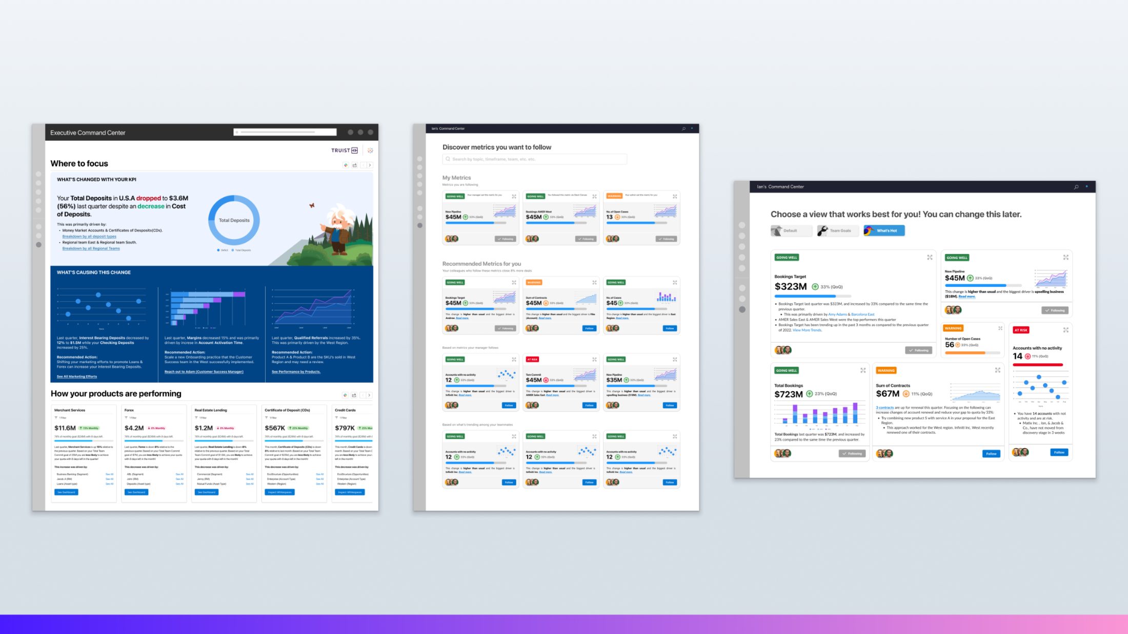
The business user was never one person. We anchored the work in three: Maggie, a sales manager who needs to spot and address problems fast; Ian, an individual contributor getting up to speed on what matters; and Emily, an executive deciding where to invest and what to scale. Every flow traced back to one of them.

Three personas for the business user. Maggie, a Sales Cloud manager who addresses problems as they are identified, deep dives into what is happening, and evaluates performance. Ian, an individual contributor in Sales and Service Cloud focused on onboarding, deciding which opportunities to focus on, and finding the best playbook. Emily, a Sales Cloud executive who watches team performance, scales best practices, and makes investment decisions.
Maggie, Ian, and Emily Manager, individual contributor, and executive. Three jobs to be done that the storytelling model had to serve at once.

From model to flows, across three sprints.

I translated the model into end to end flows, iterating across three sprints to pressure test how the experience held up at real scale. The breadth mattered: each branch explored a different persona, surface, and moment of insight.

Scroll to pan across the full breadth of the exploration.

A wide panorama of end-to-end Tableau Pulse flows explored across three sprints, dozens of connected screen thumbnails branching out from a starting point into many parallel paths
3 sprintsA panorama of the exploration. Each branch is a different persona, surface, and moment of insight, traced end to end.

Each flow followed a real persona through a real scene. Here is Ian, an individual contributor in his first week, getting his footing in Salesforce. The story moves from a welcome state to a focused, metric following home that meets him where he is.

Scroll to follow Ian's scenario across the flow.

A persona scenario storyboard for Ian, an individual contributor. It opens with a persona card and a Scene 1 narrative, then walks through a sequence of Salesforce home and dashboard states that progressively personalize to his metrics and goals.
Persona · IanAn individual contributor in week one. The scenario traces how the experience personalizes to his goals, from a generic welcome to a focused, metric following home.

The final sprint raised the fidelity all the way up. Emily, an executive, reads the state of her business in a personalized command center, pushes her exploration into a team Slack channel to ask why a number moved, then scales a best practice and coaches her team, all without leaving the flow of work.

Scroll to follow Emily's executive flow, the highest-fidelity sprint.

The high-fidelity Executive Emily flow. Emily reads the state of her business in a personalized Executive Command Center, drills into what is driving a drop in deposits, pushes her exploration into the SalesAMER Slack channel to ask a question and collaborate on a plan, then scales a best practice and coaches her team.
Persona · EmilyCommand center to Slack collaboration to scaling a practice. The last sprint, at full fidelity, showing the storytelling model in an executive's real workflow.

The north-star concepts that sold the vision.

Each concept showed AI authored data stories meeting a different persona where they already work, from Slack to the inbox to the executive command center. Together they made the future tangible enough for leadership to fund.

Scroll to move through the five concepts, one persona at a time.

North-star concept: the Data Stories app delivering a proactive insight in Slack on mobile. It tells the user their team is off-track to hit quota, explains the drivers, and offers a recommended action, annotated as Personalized Insights, Drivers, and Closing the loop.
01 · SlackProactive insight, delivered in Slack. The agent opens with what is happening, explains the drivers behind it, then closes the loop with an action to take. The what, the why, and the what next, in one glance.
North-star concept: Nexio spinning up a private Slack channel around an off-track sales goal, surfacing a correlation chart between Sales, Leads, and Open Cases, and answering follow-up questions in a thread.
02 · AgenticAgentic collaboration in the flow of work. Nexio spins up a private channel around an off track goal, surfaces correlations, and answers the why behind the why, doing the digging before a human has to.
North-star concept: an Opportunity Insights mobile home screen recommending the top two opportunities to focus on, why they matter, and recommended actions with Call and Email buttons.
03 · MobileShortening the gap from insight to value. Insights become decisions: which opportunities to focus on, why they matter, and the next action, call or email, right in reach.
North-star concept: the storytelling model embedded in Salesforce. A Sales Home with pinned metrics and Einstein Discovery, alongside a Revenue Intelligence command center showing an off-track quota with drivers and team performance.
04 · EmbeddedInsight embedded in surfaces people already use. Pinned metrics and a revenue command center bring the storytelling model into the Salesforce home and forecasting experience.
North-star concept: executive command centers. A Where to focus view explaining what changed with a KPI and what is causing it, plus a metric-following discovery experience with customizable Default, Team Goals, and What's Hot views.
05 · ExecutiveA command center for the executive persona. Where to focus, what changed, and what is causing it, with metric following and customizable views tuned to how leaders scan.
From vision to GA: Nexio's exploration narrowed to a single steel thread that shipped as Tableau Pulse, the first GA of the vision. It secured executive buy in and funding, and the interaction patterns established here now ship across Agentforce experiences at Salesforce.

Relationships first. Research second. Alignment third.

With differing executive opinions and a fragmented org structure, I knew we couldn't design our way to clarity. We had to earn it. I focused on building strong working relationships with a core trio — one PM and my two design managers — as an anchor, then broadened out to sales teams, cross-functional PMs, and engineering leads to gather diverse perspectives and build influence.

From that foundation, we ran extensive user research across three core personas — the business executive, the operational manager, and the analyst. We ran workshops with PMs, engineers, and architects to build comprehensive journey maps that gave us a shared language across the org.

Rapid iteration was the engine. I worked directly with the PM to refine use cases and scenarios for the two primary personas, testing concepts with real customers early enough to course-correct before we committed to engineering.

"The turning point was when we presented our designs to Salesforce's top enterprise customers. The response was overwhelmingly positive — they didn't just like it, they wanted it. That market validation gave us the executive buy-in to move from concept to product."

What we chose, and what we said no to.

🎯
Signal over noise — the Usual/Unusual/Normal taxonomy

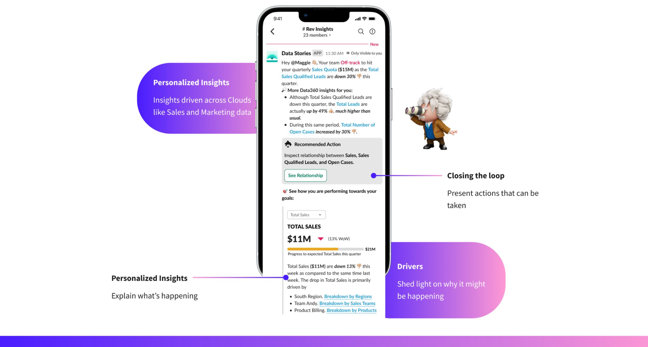
We could have shown users raw statistical variance. Instead, we translated AI confidence into plain-language status labels — Usual, Unusual, Normal. This required close alignment with Data Science to ensure the labels mapped accurately to model outputs, but it made the AI feel legible without dumbing it down.

Tradeoff: Less precision for analysts, but dramatically higher trust and usability for business users.
📧
Email as the primary entry point

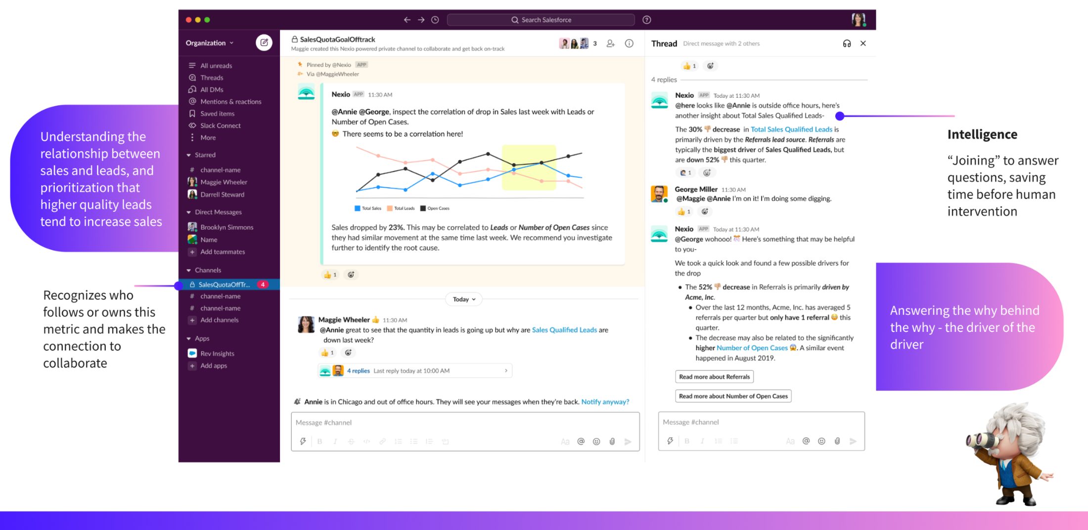
We debated whether to make the homepage or the email digest the "front door" to Pulse. We chose email — because business users live in their inbox, not in analytics tools. This meant designing an experience that had to work standalone, without any Pulse context, while still driving users back to the product.

Tradeoff: Higher design complexity, but dramatically lower activation friction for non-analyst users.
💬
Natural language Q&A on metric detail

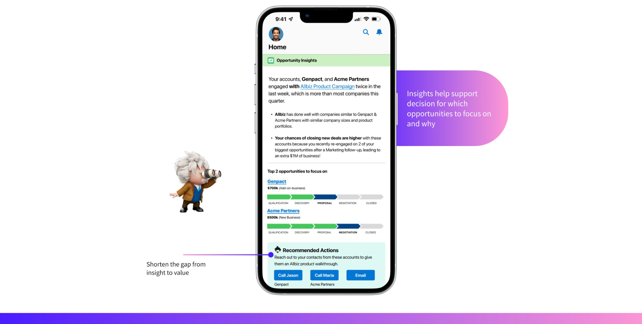
Rather than forcing users into filter panels to investigate anomalies, we designed a conversational "Ask a question" interface on the metric detail page. This was a significant bet on AI UX patterns that were still unproven at enterprise scale — but research showed it matched how business users actually think about data.

Tradeoff: Higher engineering complexity, but a more natural interaction model for the target persona.
👥
Social signals — follower counts and recommendations

We added follower counts and team-based metric recommendations to the homepage and search. The insight from research: business users trust what their colleagues track. Social proof reduced the decision overhead of "which metrics should I follow" — a critical onboarding friction point.

Tradeoff: Required privacy and permission modeling with Engineering, but accelerated time-to-value for new users.

Five surfaces. One coherent system.

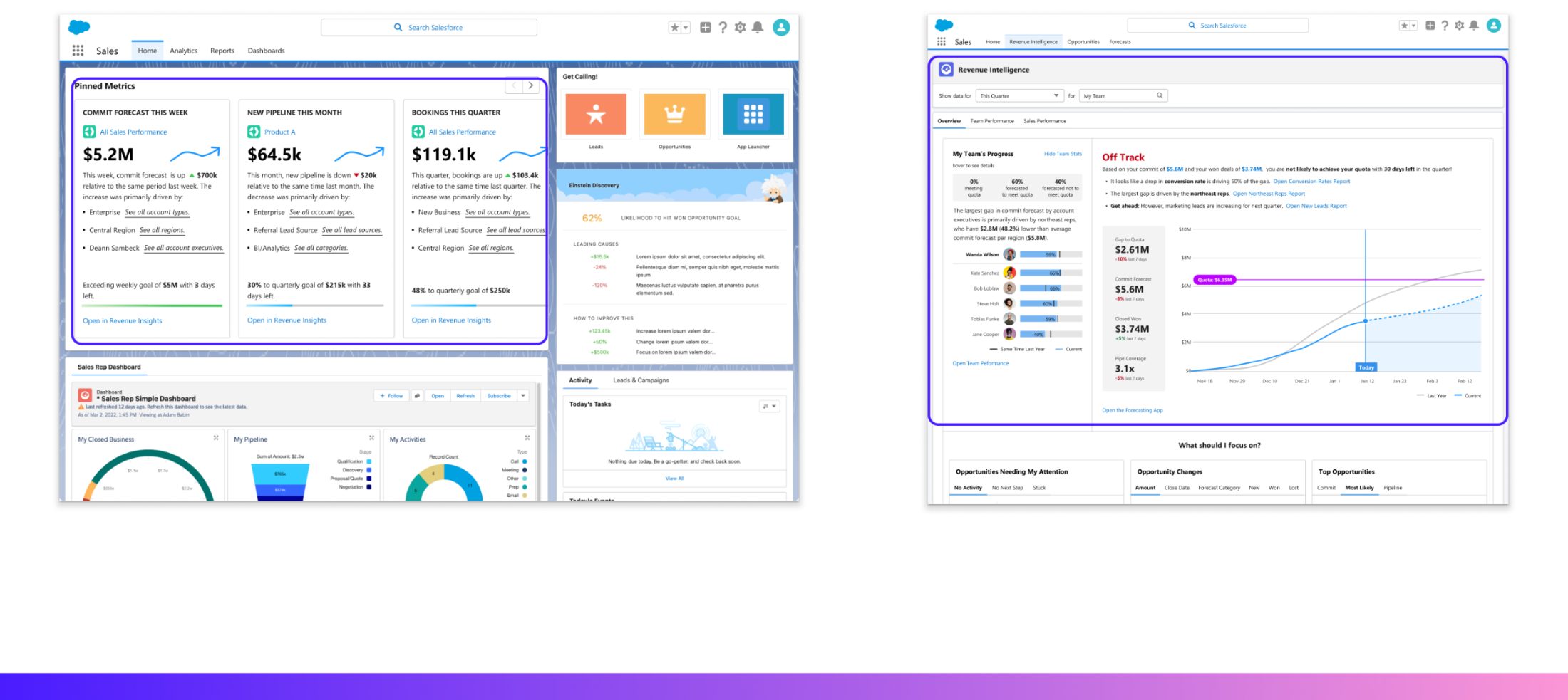
I owned the end-to-end design for the Pulse steel thread — Homepage, Email Digest, Metric Detail, Search typeahead, and Search results — ensuring they worked as a unified experience across every entry point.

It all starts with one unit: the metric card. Every element earns its place — translating a wall of statistics into something a business user can read in seconds, trust, and act on. Get this right, and it scales across every surface.

Anatomy of a Pulse metric card — annotated breakdown: BAN and metric title with time period and filters, trend badge showing sentiment through color and text, period-over-period change, trend chart, NLG-generated top-contributor insight with actions, data-freshness timestamp for trust, and follower count to leverage FOMO
Anatomy of a metric card — the science behind the sizzle Every element is a deliberate decision: a big bold number for instant relatability, sentiment badges that make AI legible, period-over-period change, the trend chart, NLG-generated contributors paired with a next action, a freshness timestamp to earn trust, and follower counts that turn social proof into FOMO.
Tableau Pulse daily metric digest delivered to a Gmail inbox — a personalized weekly summary with three metric cards (Website Actions, Clicks, Downloads), each showing the value, period-over-period change, and NLG top-contributor insight, designed to work standalone in the inbox
Metrics Email Digest The primary entry point for business users — a personalized daily digest delivered to their inbox, surfacing unusual movements in metrics they follow. Designed to work standalone without any Pulse context.
Tableau Pulse metric detail — Appliance Sales drill-down with AI insight explaining top product drivers of an unusual increase, conversational follow-on questions, and a contribution bar chart
Metric Detail — AI-Powered Insight The drill-down experience. Natural language AI insights explain what's driving change, with a conversational Q&A interface for further investigation. Designed to make statistical analysis feel like a conversation. Co-designed with a Tableau designer.
Tableau Pulse search typeahead — as the user types 'Ad', a dropdown surfaces matching metrics like Ad Reach and Ad Spend with follower counts as social-proof signals
Search — Typeahead Instant metric discovery with follower counts as social proof signals, helping users find the right metrics faster.
Tableau Pulse search results — a dedicated results page for 'Ad Reach for Google Ads in North America' showing six metric variant cards by dimension, each with impressions, follower count, and a Follow action
Search — Results Full results page showing metric variants by dimension, allowing users to find exactly the slice of data most relevant to their role.

From concept to 100M insights in one quarter.

100M+ AI insights generated in the first quarter after launch
35k+ Metrics created by enterprise customers in Q1
GA Launched to enterprise customers with strong early adoption
🎤

Showcased live at Dreamforce 2022 & Tableau Conference

Tableau Pulse was demoed on the main stage with branded, live demos from L'Oréal, Ford, and Truist Bank — a direct result of the customer validation work that helped secure executive buy-in.

Beyond the numbers, this project helped pivot Tableau toward a business-user-first analytics strategy — shifting the product's center of gravity from analyst-centric dashboards toward ambient, AI-driven intelligence for everyday decision-makers.

I'd invest earlier in an explicit AI explainability framework. We spent a lot of cycles debating how to communicate AI confidence case-by-case. In hindsight, establishing shared principles for how the product surfaces uncertainty — across the homepage, email, and detail view — before design started would have accelerated alignment and produced a more consistent system.

I'd also push harder for a defined onboarding flow from day one. The follow/recommendation system worked well once users understood it, but we underinvested in the moment when a new user asks "where do I even start?" The first-run experience was something we iterated on reactively rather than designing proactively.

These aren't failures — they're the natural result of moving fast in a post-acquisition environment with high ambiguity. But they shaped how I approach AI UX today: explainability and onboarding are not features you add at the end.

© 2026 · aditya yellamraju · handcrafted, then robot-polished no designers were replaced in the making of this site
Vibe coded · Claude