
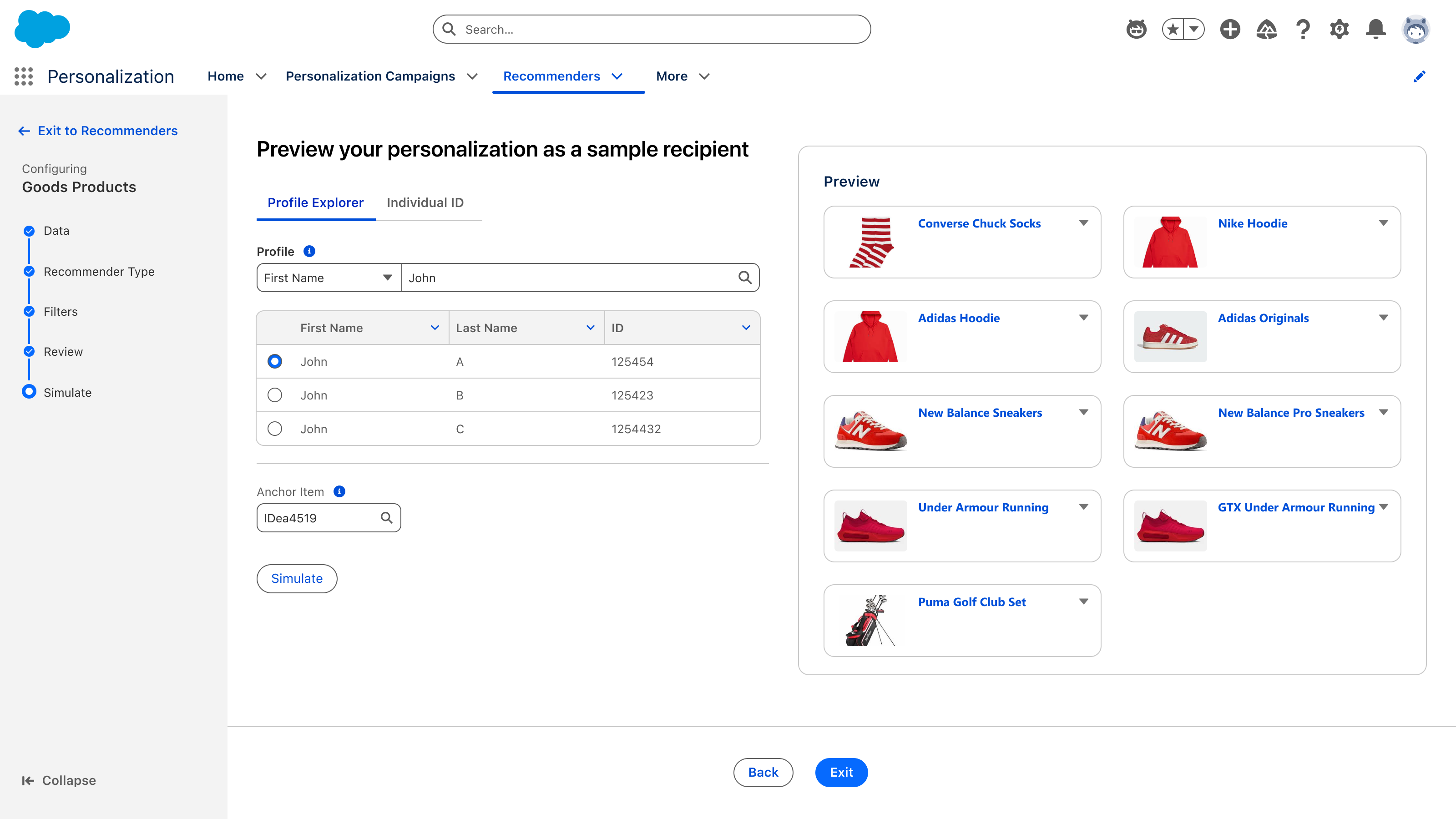
The payoff: pick a real profile, hit Simulate, and see exactly what that person would be shown — before anything ships.
A companion case study to the Personalization Core platform redesign. Three connected surfaces that turn a deeply technical configuration problem — scoping a product or content catalog, defining filter rules, choosing a recommender strategy — into something a marketer can do with a conversation and a few clicks.
The payoff: pick a real profile, hit Simulate, and see exactly what that person would be shown — before anything ships.
Salesforce Personalization is a real-time decisioning engine — it picks the right product, article, or piece of content for each customer in the moment. Recommenders are the configurable strategies that drive that decision: collaborative filtering, content-based scoring, behavioral signals, business rules, and combinations of all of the above.
Marketers don't think in terms of cosine similarity or graph traversal. They think: "I want first-time visitors to see our most-viewed seasonal items, but exclude anything we're running low on." The product had to bridge that gap — between marketer intent and a working ML strategy — without dumbing down what the engine could actually do.
Three problems sat on top of each other — each made the next one worse.

Rule-based recommender setup. Three dropdowns named after the data model — "Calculated Insight," "Sort measure" — and a help panel doing the explaining the form couldn't.

The filter builder. Resource, Type, Operator, Profile DG Resource, then a nested WHERE clause underneath — a query language rendered as form fields, with no preview of what it actually matched.
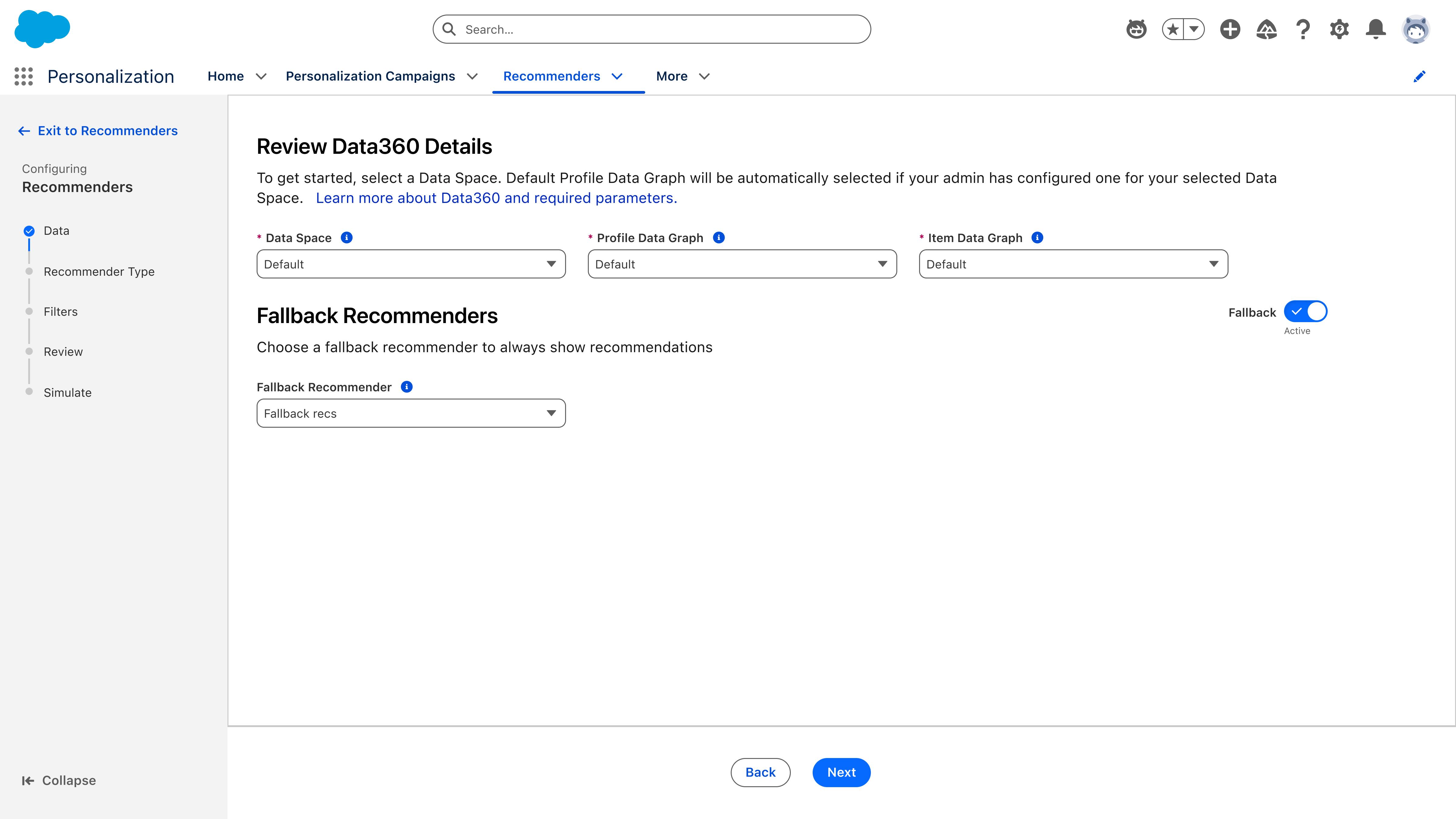
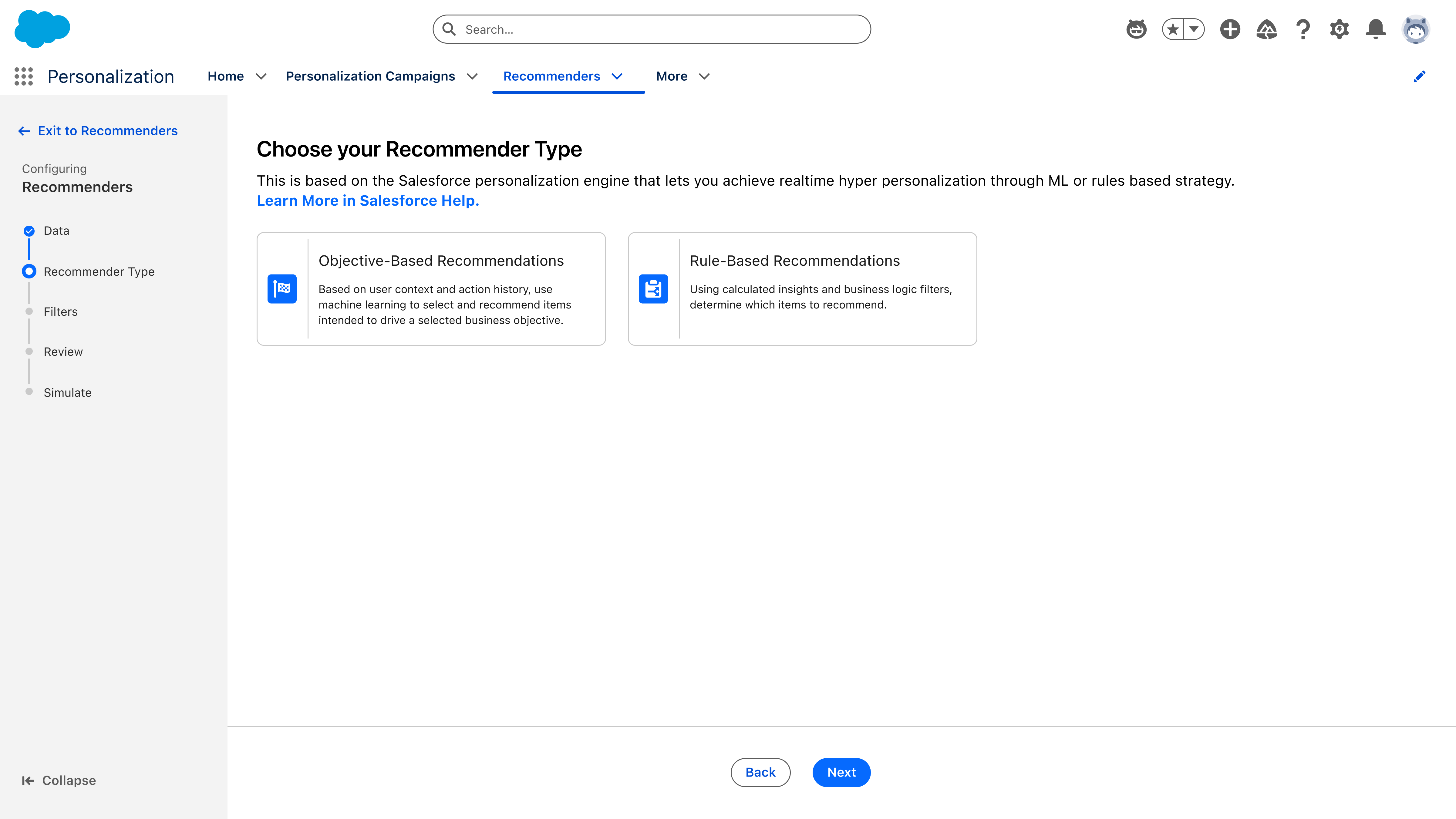
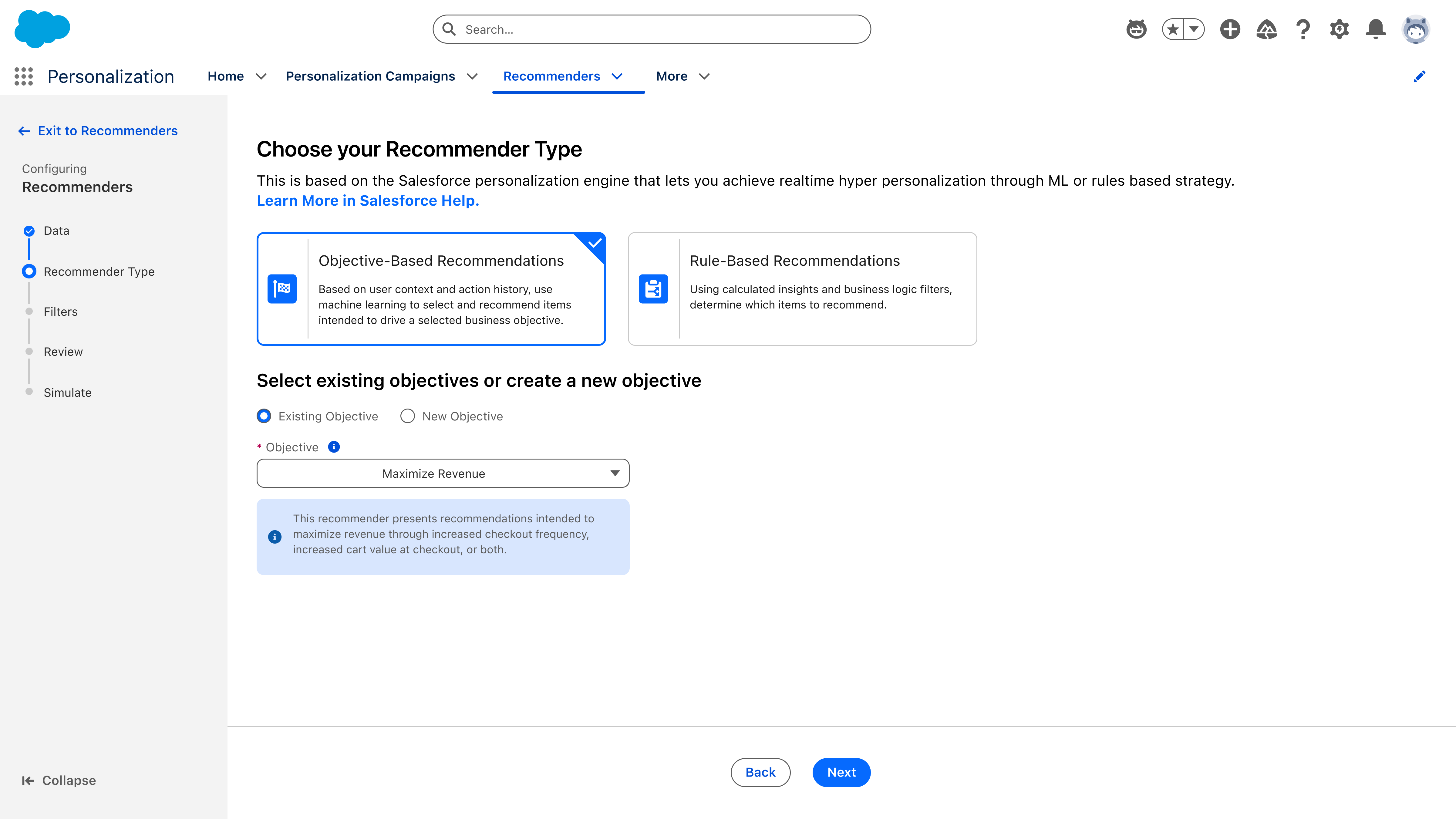
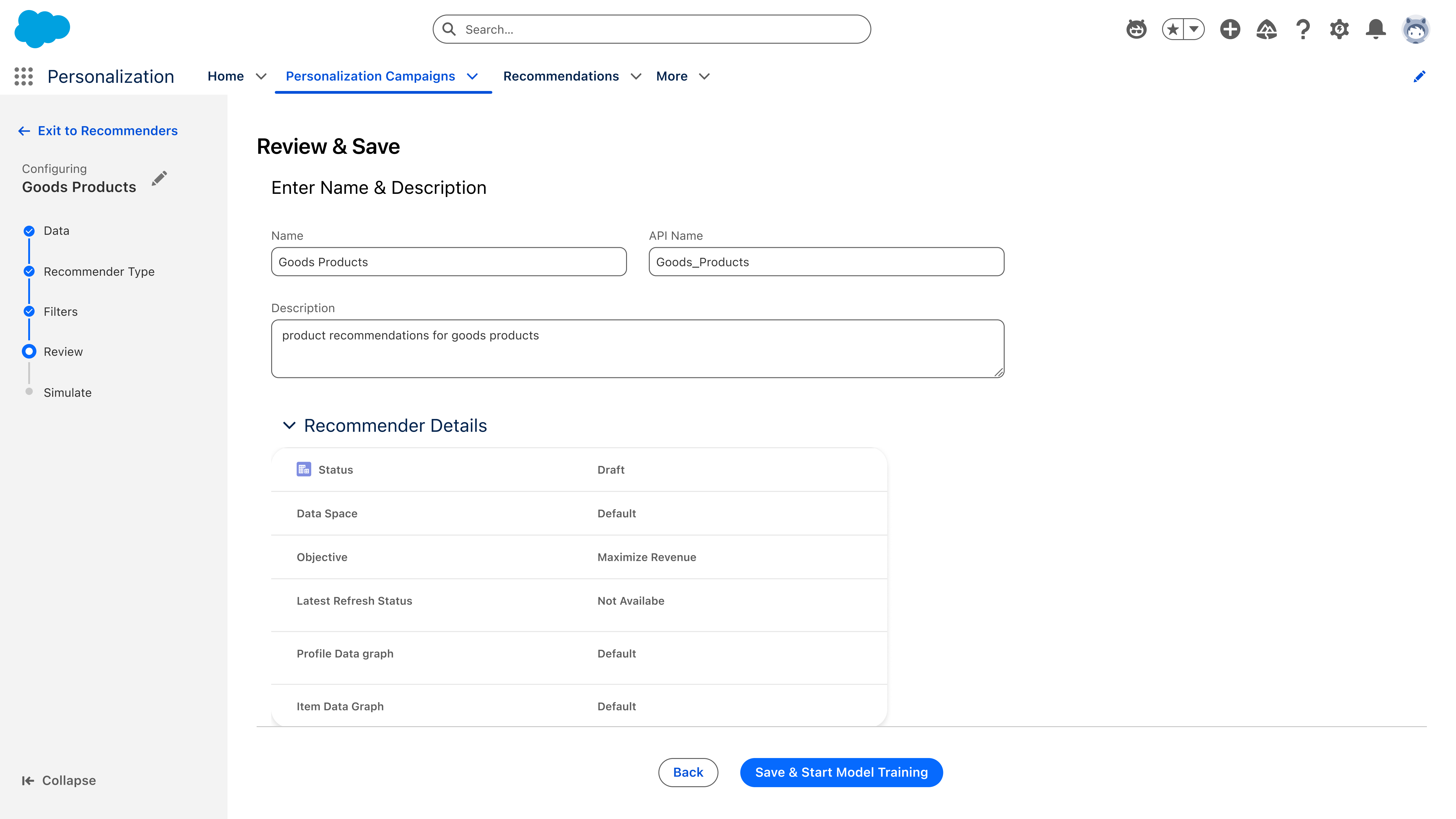
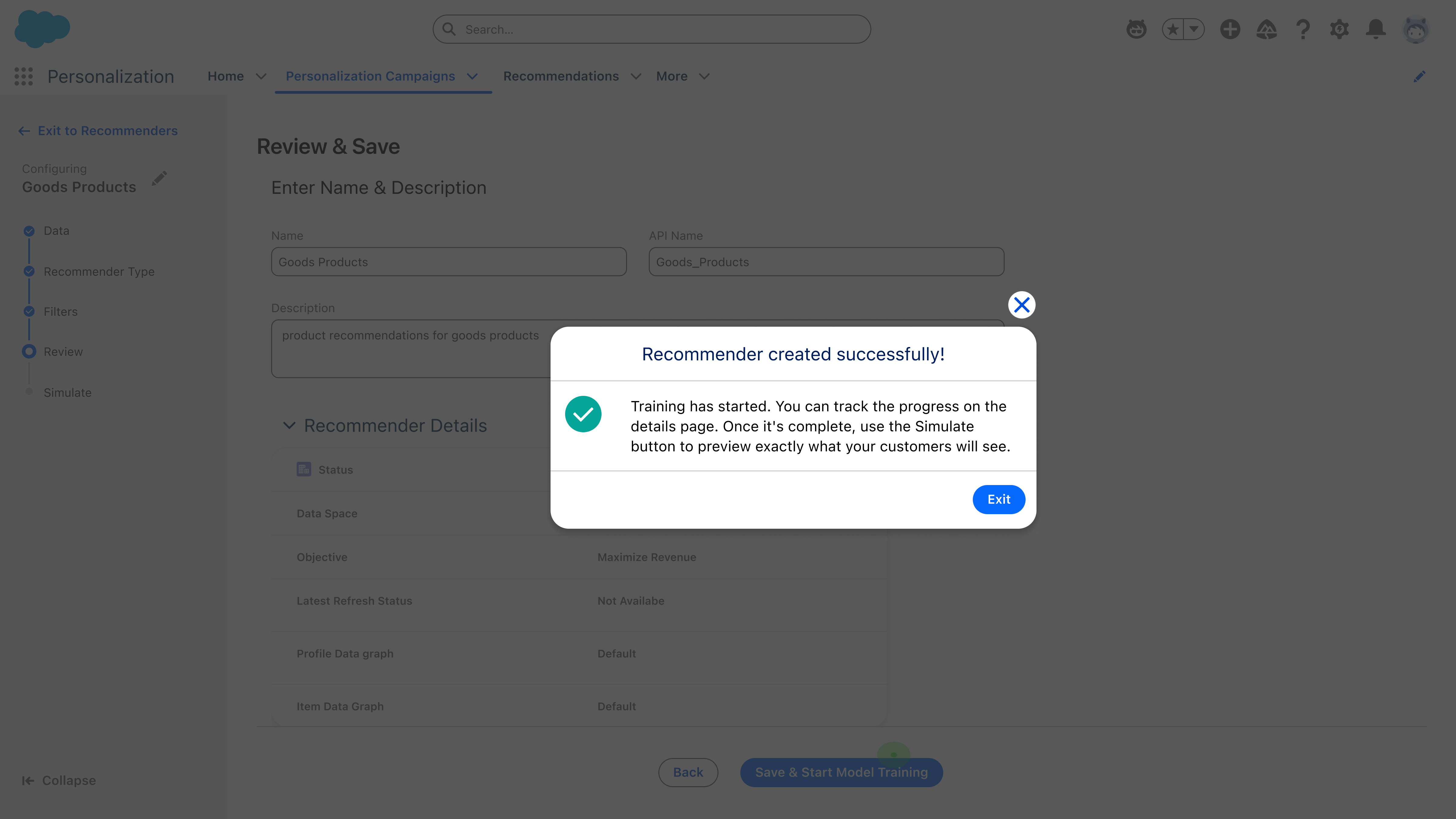
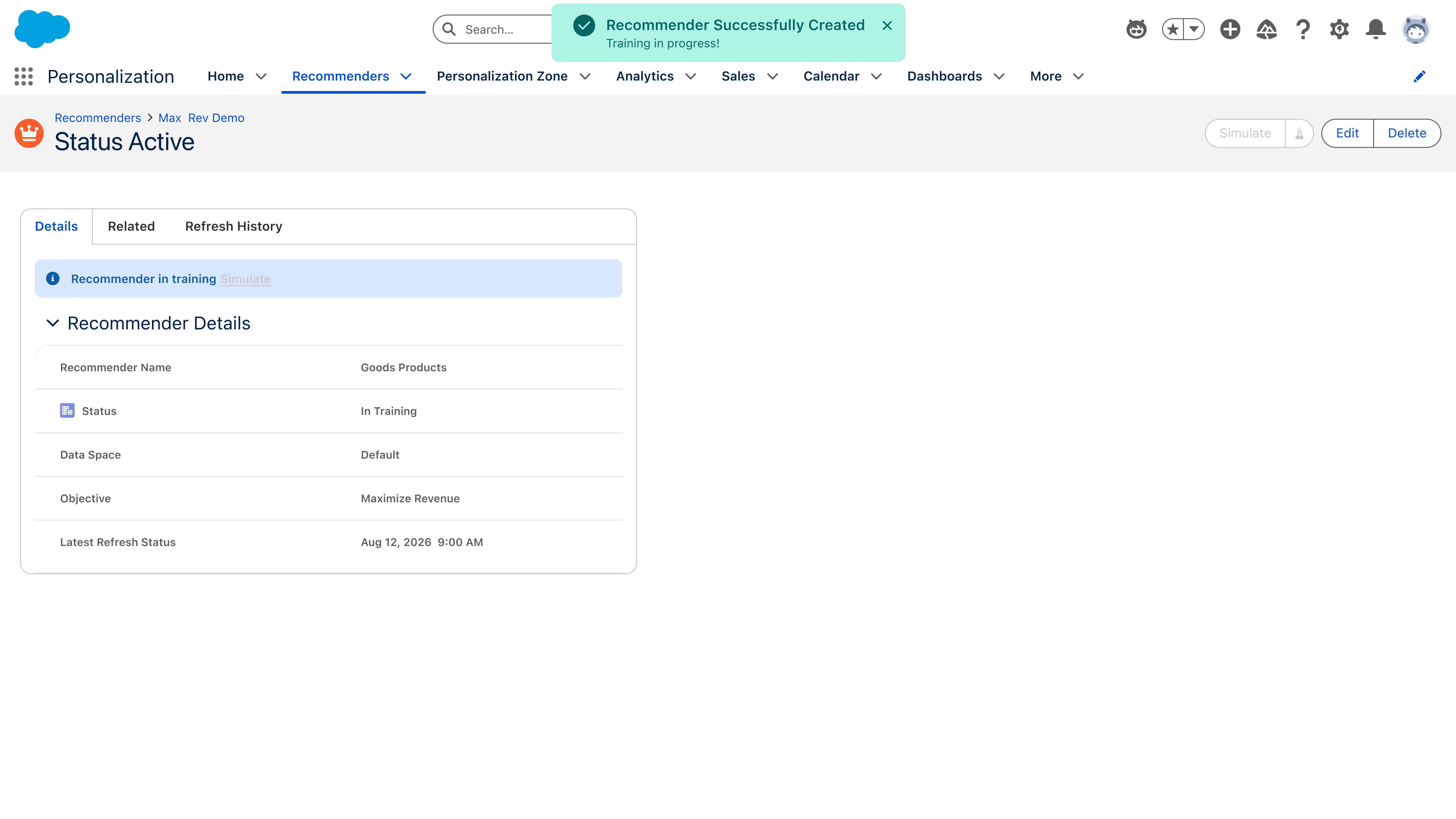
Every "customers also bought" strip, every "recommended for you" row, every product suggestion in an email starts as a configuration decision someone has to make. Salesforce describes the outcome in three words — collaborative filtering, content-based, hybrid — but a marketer setting one up has to answer harder questions: which data does this draw from, which of the three approaches fits the goal, which slice of a 65,000-item catalog is even eligible, and will the output hold up before it reaches a real customer. This flow is where those answers get made. Five steps, each one question, ending in a simulation against a real profile so nothing ships on faith.
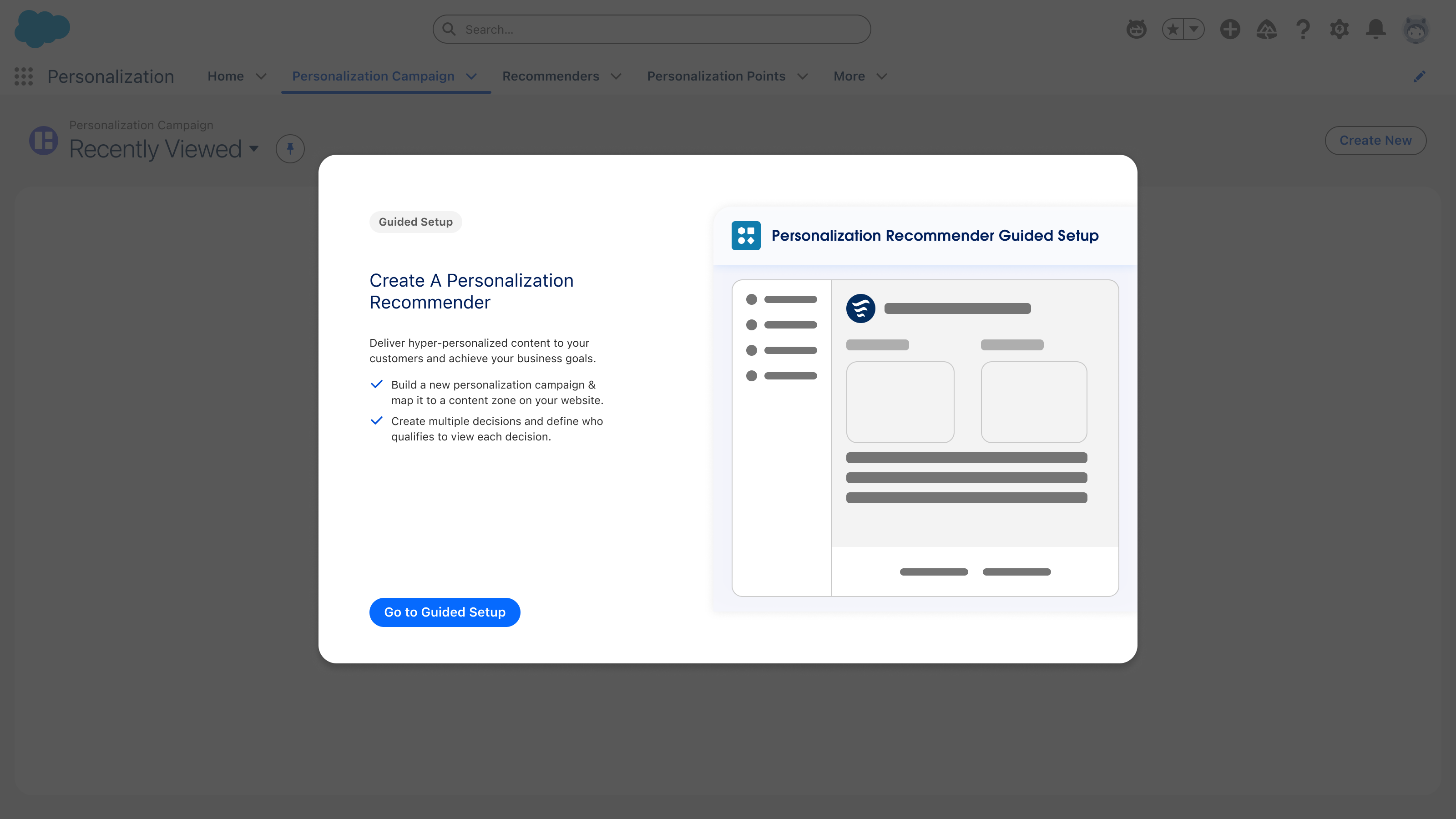
This flow isn't a new pattern. It's the guided setup pattern I established for Personalization Campaigns, applied to a completely different object. Campaigns asked Where → What → Who → How; recommenders ask Data → Type → Objective → Filters → Review. Different questions, identical scaffolding: one decision per step, a persistent left rail that shows where you are and what's left, defaults pre-filled from admin settings, guidance in the rail rather than a separate tab, and a review table before anything commits.
That reuse was the test of the pattern. A configuration spine built for one object turned out to hold for another with a different data model, a different persona mix, and an ML step in the middle — which is what made it worth standardizing rather than treating as a one-off screen design.
Scroll to walk through it — entry, Data, Recommender Type, Filters, Review, and Simulate.
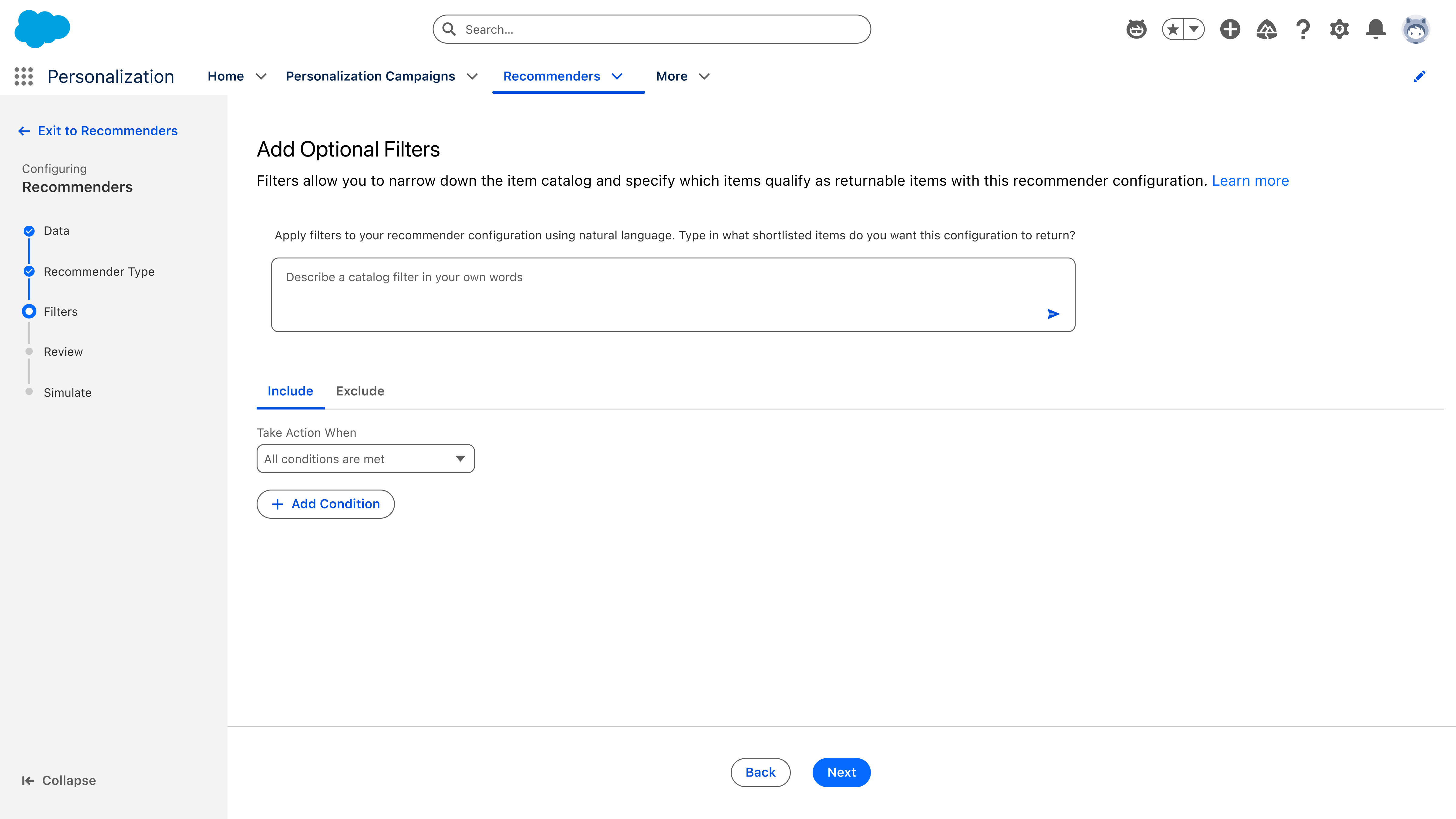
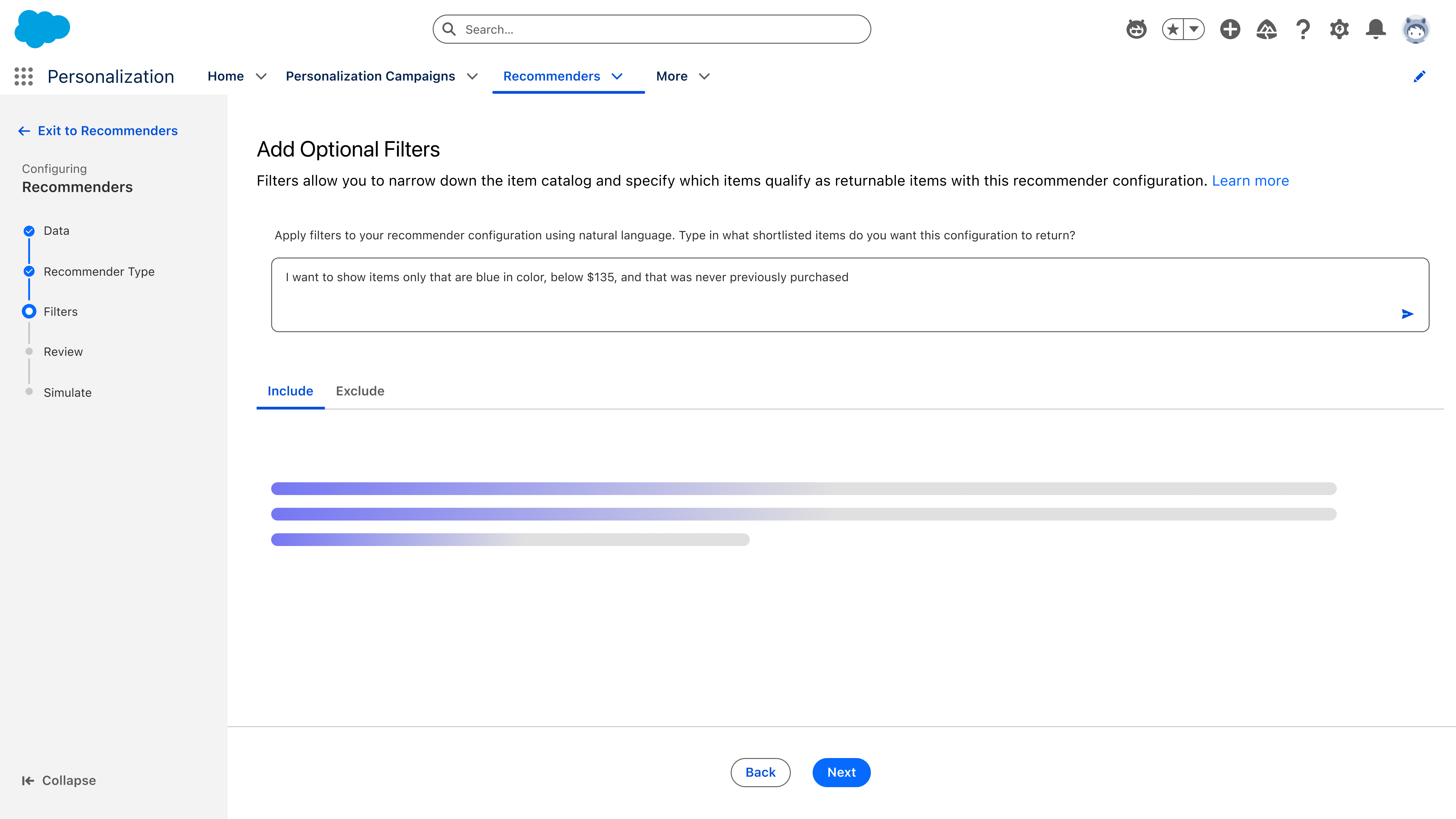
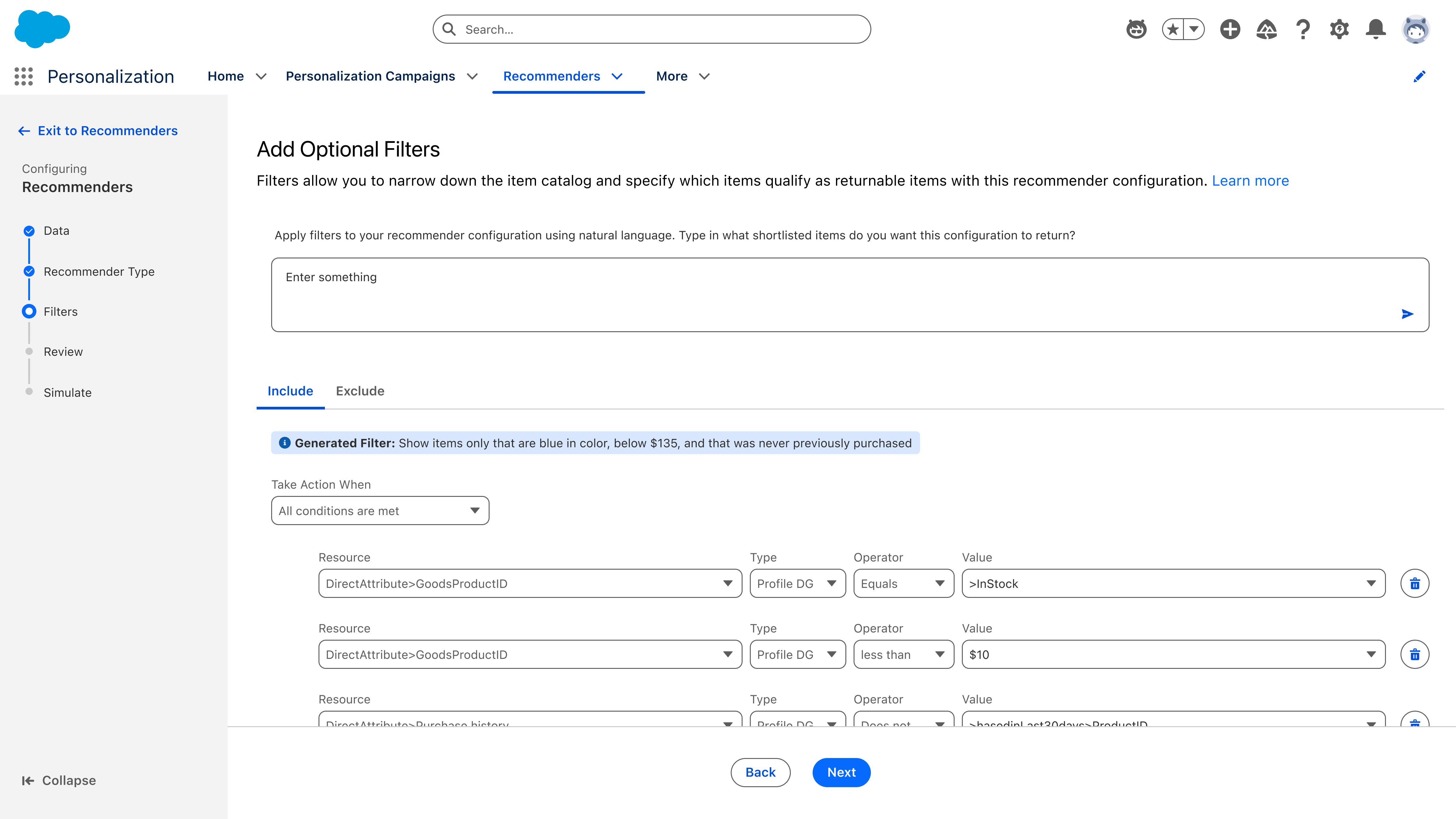
A conversational layer that sits on top of the visual builder, not instead of it. The marketer types "show me men's running shoes under $120 that are in stock in the EU and have at least 50 reviews" — the agent proposes the filter graph, populates the visual builder, and shows the live match count. The marketer can then edit visually, refine in chat, or both. The agent is a starting point, not a black box.
The marketer states an outcome — "recommend products that pair well with what's in the cart" — and the agent leads a guided setup: it proposes the right strategy (cross-sell, complementary, behavioral), suggests scoping filters, picks reasonable defaults for cold-start and fallback, and previews the live output against real customer profiles. The marketer ends with a tunable recommender, not a decision tree they have to navigate alone.

The agent builds the recommender and hands back a summary card — objective, data space, both data graphs, and the filters it applied. "Add to Decision" and "Edit" sit right on the card, so the marketer can ship it or open it up. Below, suggested next moves keep the conversation going instead of leaving a blank prompt.

One sentence of refinement — "products below $200" — and the card updates in place: the filter list grows, the catalog count drops from 65k to 10k. The count is the honesty mechanism; the marketer sees the scope tighten before anything goes live.
The recommendations workstream took the most technical surfaces in the product and made them the most marketer-friendly. Filter rules that previously required Professional Services became something a marketer could draft in a chat box. Recommender setup went from a wall of strategy options to a guided conversation. And every AI action stayed editable — which is what made the AI shippable in an enterprise org that had every reason to be cautious.
More information about the public Salesforce Personalization product: salesforce.com/marketing/personalization